Top 6 fintech onboarding journeys
15 Dec 2022 — PRODUCT

Financial services like lending, banking and investments are complex and thus, highly regulated. Stringent rules are imposed by regulators to render such financial services only to the users whose identities are legitimate and verified, to reduce the risk of fraud.
In order to verify a user’s identity, fintechs startups have to collect national identity documents like PAN or Aadhaar and verify them with public databases. If money is being transferred to users, their bank details must be verified too. So, building a fintech onboarding journey is decidedly tricky. On one side, KYC guidelines must be followed, no matter what. On the other, users shouldn’t be overwhelmed by the amount of information being asked of them. It’s no wonder that finding the right balance is difficult.
While such guidelines do constrain fintech companies, they also provide an opportunity for them to stand out. The best fintech UX can tread the fine line between compliance and a perfect customer experience. So without further ado, let’s explore what we think are the top 6 fintech onboarding journeys in India, in no particular order.
Jupiter#
Jupiter is a popular neo-bank that lets customers digitally set up their savings accounts. They also offer UPI payments, investments, bill payments and more, in partnership with the RBI-regulated Federal bank.
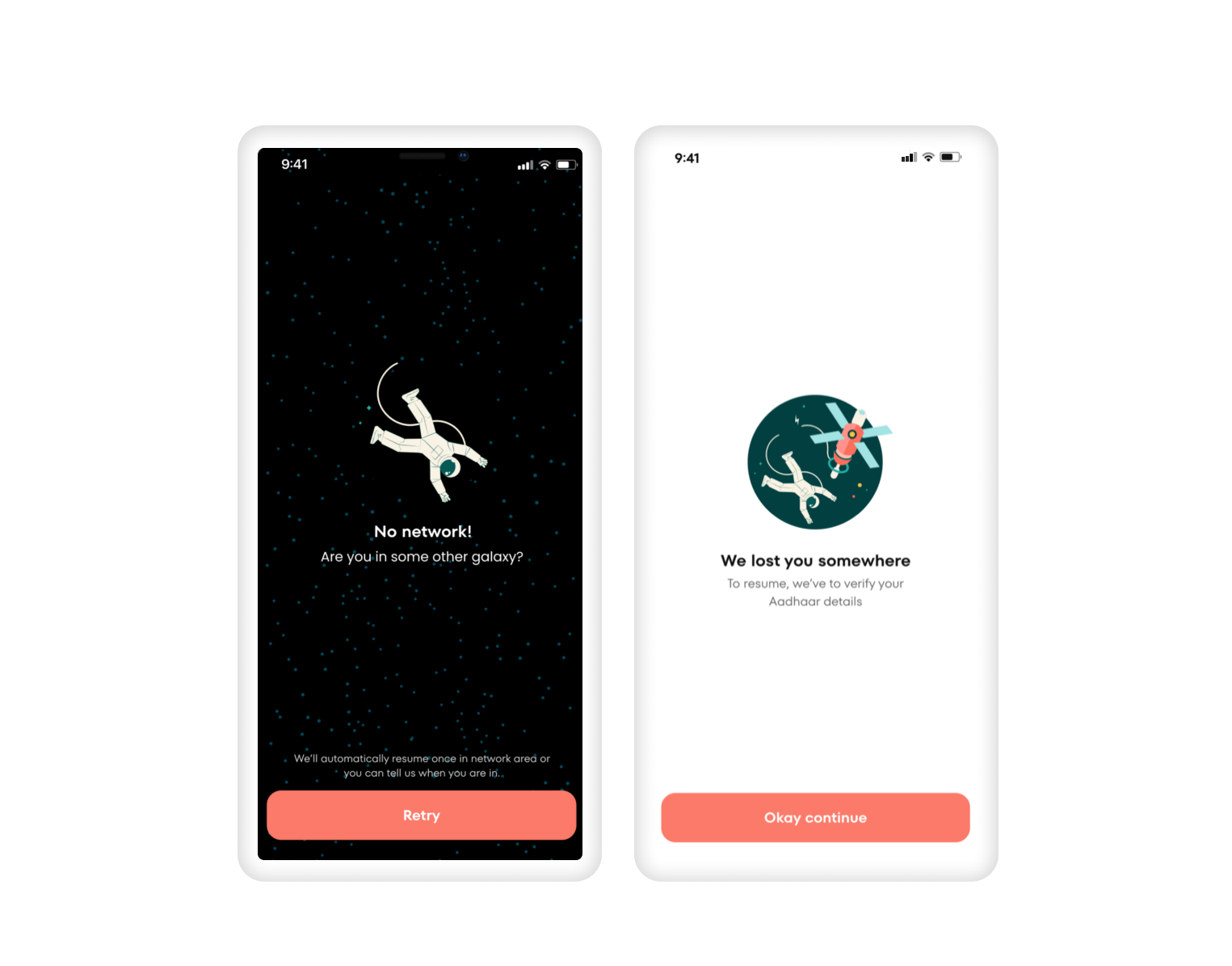
Opening a fully functional bank account, requires several steps as mandated by the RBI. Building a detailed, yet simple experience to convert customers is key. Jupiter’s onboarding flow is clean, and reduces a user’s cognitive load by pre-filling details. They also curate the experience with clever, creative screens to reduce drop offs due to unexpected issues—like when network is low, or if there is an error in saving details.
Groww#
Groww’s blue and green logo is widely recognised. It is one of the biggest digital investment platforms in India today (and growing), and onboarding users to open digital Demat accounts is a key metric that Groww optimises for.
Groww’s emphasis on progressive disclosure is one of the many reasons they make it to our list. Progressive disclosure is a design pattern that discloses information in defined stages, so that a user isn’t overwhelmed by the length of a questionnaire.
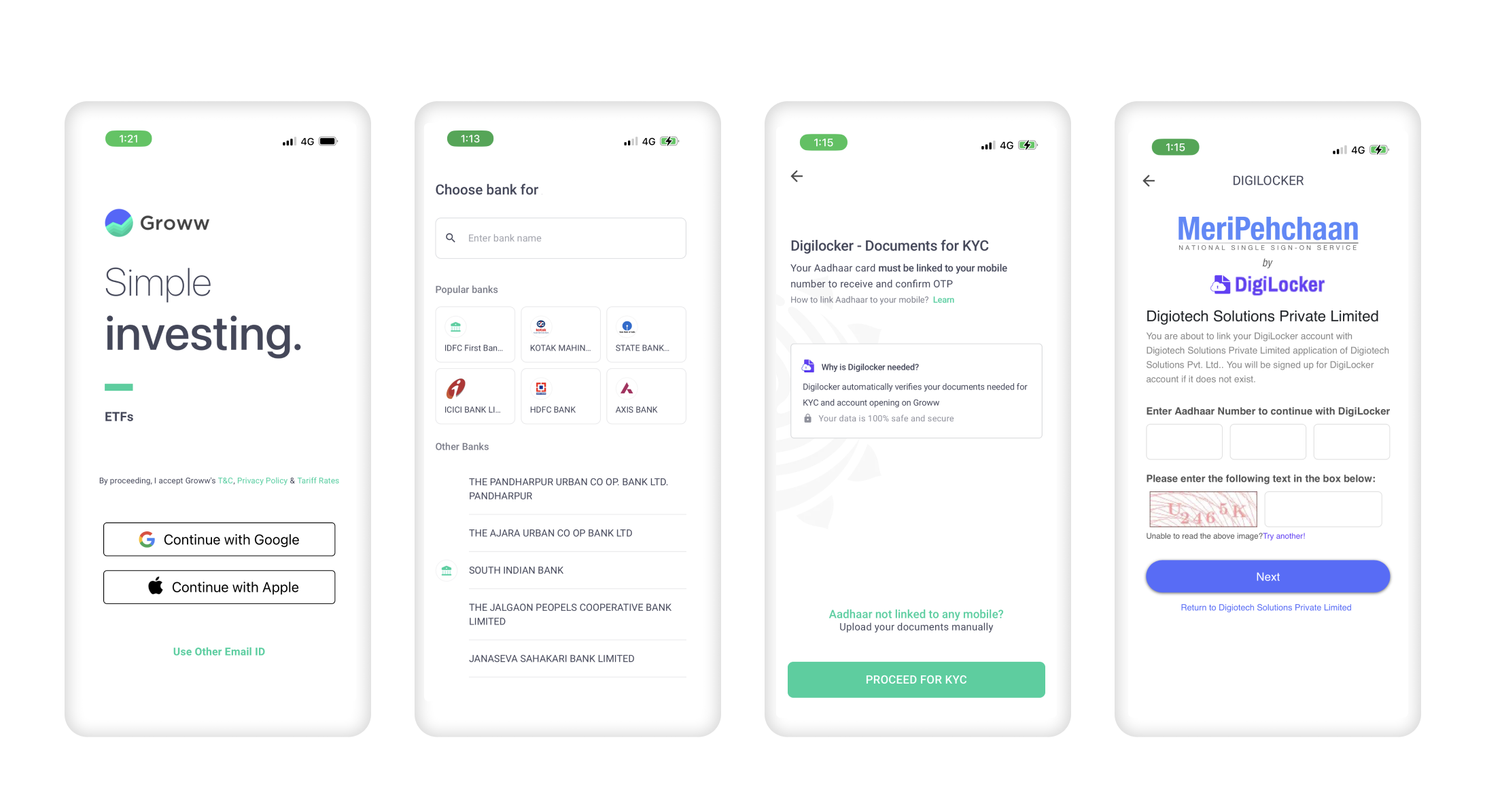
The one quibble we have is with the last step to complete onboarding, where a user has to eSign a document. Today there is redirection to a non-branded, non-native screen, where an OTP sent to the user’s Aadhaar-linked mobile has to be entered.
Perhaps custom screens, with Groww’s logo and colours, could be built with Setu’s customisable eSign APIs. No hidden agenda, just a segue to introduce our product.
Navi#
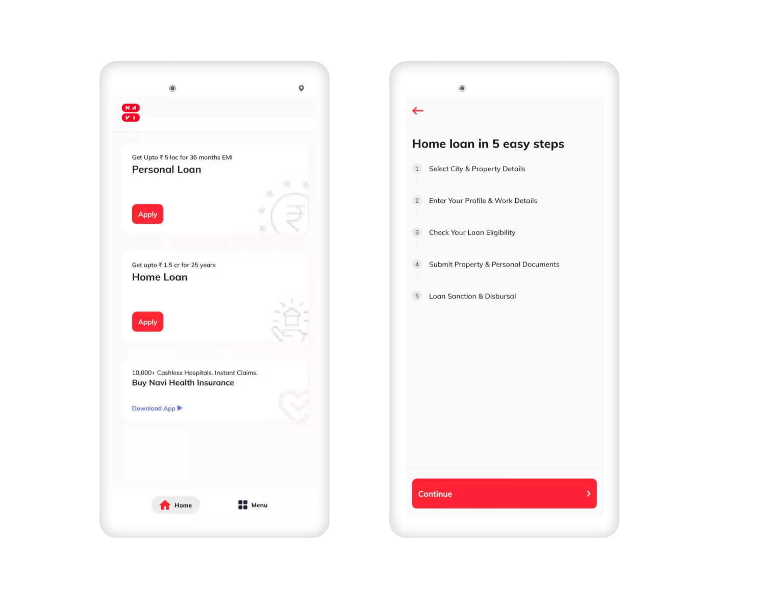
Navi is a fintech platform that offers multiple financial products like loans, insurance and mutual fund investments. Another great fintech platform with a robust onboarding journey.
One of the best aspects of Navi’s onboarding journey is that a user can view the financial products Navi offers, right after a one-step mobile OTP login. This lets users experience the ‘Aha’ moment faster, where they recognises the value of the platform. Users can then complete onboarding for the product(s) they’re interested in.
Another great touch is the summary of the steps needed to onboard successfully—say, a 5-step process for a home loan application—that’s conveyed to the user right away.
Dezerv#
Dezerv is a relatively new fintech startup—a financial advisory and investment management platform for retail investors like you and me—that makes it to our list for their high emphasis on simplicity.
Dezerv’s onboarding is as simple as it can get. The entire onboarding journey contains great copy. Dezerv’s tagline ‘Help us design a portfolio for you’ flashes throughout, creating a higher impetus to complete onboarding. On the last screen, Dezerv shows testimonials from their power users, invoking a sense of community, social proof and validation.

Cred#
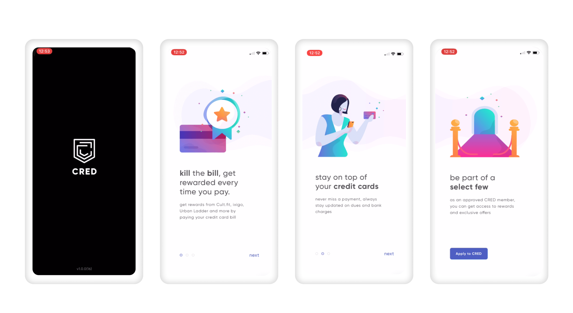
We cannot create a list of fintechs without mentioning Cred, one India’s most popular (and controversial) fintech companies. Say what you will about Cred and their coins, but their customer onboarding experience is second to none.
Since Cred started out as a credit card management platform, they do not need to verify a user’s KYC during sign up. It is only when a user opts for financial services like their P2P lending product—Cred Mint—that they ask a user to complete KYC. For this Cred just needs PAN and bank account details, for users who’re already eligible based on their financial health scores.
As an aside, Cred also plays the exclusivity card quite well. They position themselves as aspirational for the country’s 1%, making it a compelling reason for users to want in.
Fi Money#
Another popular neo-bank, Fi Money, makes it to our list. Fi is a money management platform that wants to reimagine banking in India. Fi, partnering with Federal Bank, offers the fastest way to open a bank account online.
Opening a bank account involves several steps like Video-KYC, PAN and Aadhaar verification etc, and a simple onboarding process is key to high conversion. Fi has a beautiful onboarding flow—employing ‘Progressive disclosure’ as a design principle here too—that is intuitive for any user. They also pepper their content with emojis and GenZ lingo to strike a chord with their core demographic.

While these are the 6 fintechs we’ve highlighted for their onboarding journeys’, several others might have been missed. If you have a suggestion to add to the list, do write to us at growth@setu.co and we’ll be glad to feature it in one of our subsequent articles.
A quick note about Setu#
Setu is a fintech API Infrastructure company that enable fintechs and financial instiutuions to build powerful and personalised onboarding journeys for their users. See how Kissht and ETmoney built powerful onboarding journeys with Setu's APIs.


