How we designed the consent manager—AA web app

Vivek G
Product Designer
11 Aug 2021 — DESIGN AND EVANGELISM — FREE YOUR DATA
ACCOUNT AGGREGATOR

Illustrations by: Prajna Nayak
This article is an account of processes, failure and success stories during the design of Account Aggregator(AA) web app—an important user facing aspect of the AA framework.
A little context about why AA is needed#
Take a moment to think how our own financial data is presented to us, as individuals. We have them in passbooks, downloaded PDFs, IT return forms, bank certificates/bonds. Can we really make overall sense of this data in any of these formats?
No wonder that we do not have a bird’s eye view of our own financial information most of the time—unless we are paying constant attention. We also cannot access a lot of financial services through digital modes because the food itself is not digital—it is stuck in papers and documents!
Account aggregator is a regulated framework setup by the RBI to facilitate secure movement of this data between entities that hold financial data (banks and other financial institutions) and those who wish to use this data for providing financial services—with clear consent of the individual to whom the data belongs to. AA can potentially unlock a lot of financial use cases—enabling apps to make sense of our financial data or providing us financial services is just the tip of the iceberg!
If you want to read more about Account Aggregators, jump here. Otherwise, let’s begin the show!
A little about how AA works#
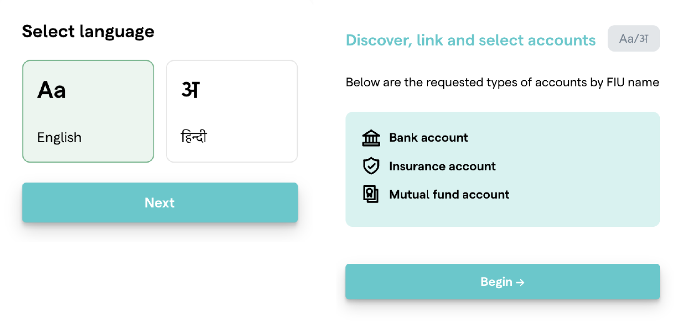
In the Account Aggregator framework, the data sharing between entities holding financial data (called Financial Information Provider—FIP) and entities using them to provide financial services (called Financial Information User—FIU) happens through a third, data blind entity called the Account Aggregator (AA).
Whenever the FIU wants to access some financial information of an individual, the FIU sends a “consent request” to the AA and also redirects the individual to the AA. The individual is expected to review the consent sent by the FIU and then approve the consent securely on the AA platform.
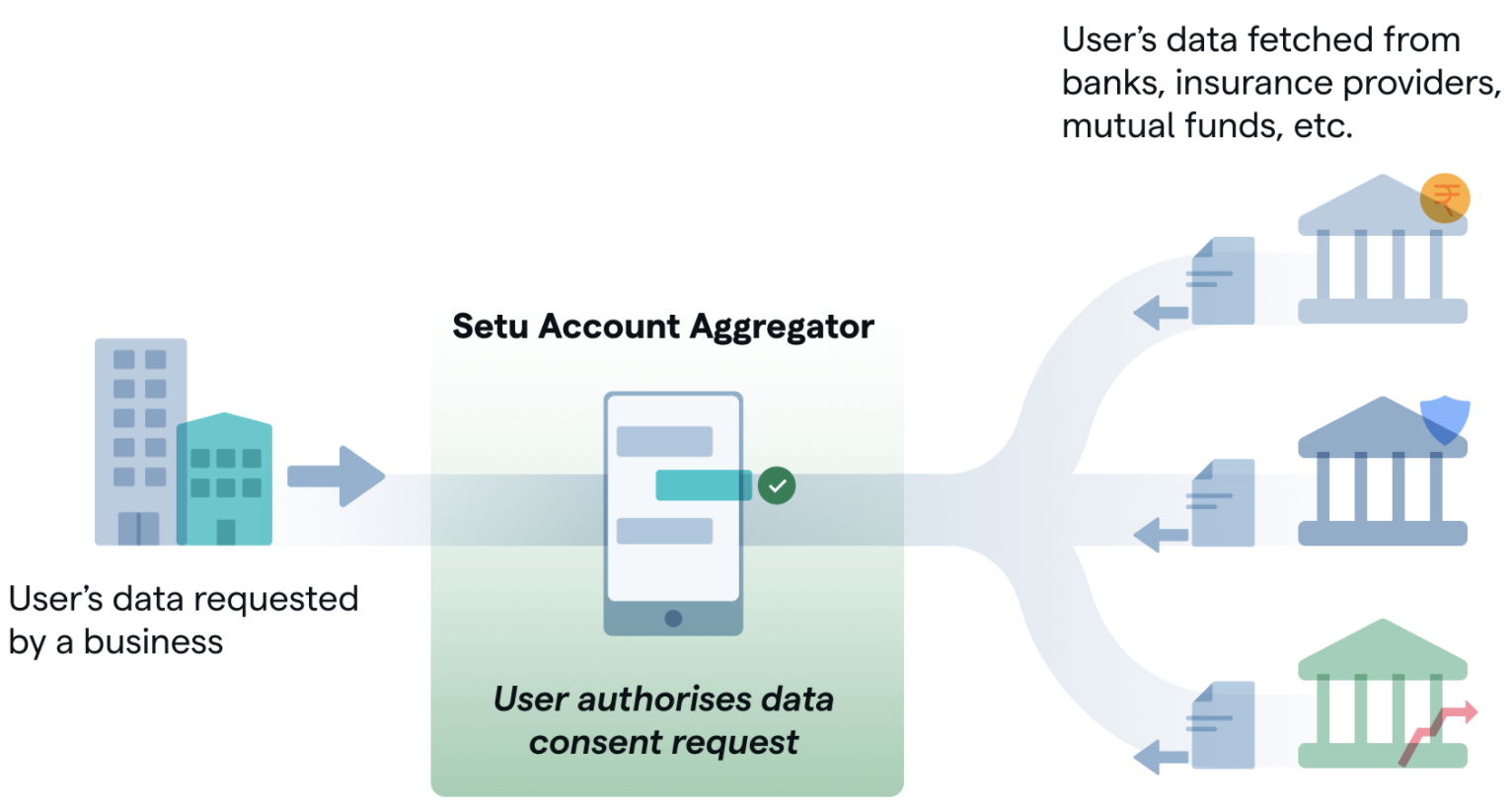
Post approval, the FIU is allowed to access the financial data of the said individual, strictly according to what was approved by the individual. AA is the data pipe for data flow from FIP to the FIU—as per approved rules in the consent—in an encrypted format.
We ventured to build the web app that individuals will use to review consents, approve and manage them—phew!
A little about our objectives#
We wanted to build a web app that is very simple, easy to use, seamless and what not! Leaving out the magic words and focussing on function, we wanted to build a web app—
-
That works for people across various levels of financial literacy
-
That helps people to use the app in their language
-
That inspires trust and does not trick or manipulate people
-
And of course, plays its small role, to help the AA ecosystem bloom to full potential!
Some problems opportunities#
Communicating a new financial instrument#
Today, concepts such as cards / online payments / UPI are part of everyday conversations. When these words are used on any UI, they do not warrant an elaborate effort to communicate what they really mean—people can just understand by the word.
When we were building the web app, we were looking at communicating ideas and concepts that did not exist till now—no obvious analogies to help the user relate to. Some of them were—
-
Working model of account aggregator eco-system and where the user actually comes in
-
Concept of a consent
-
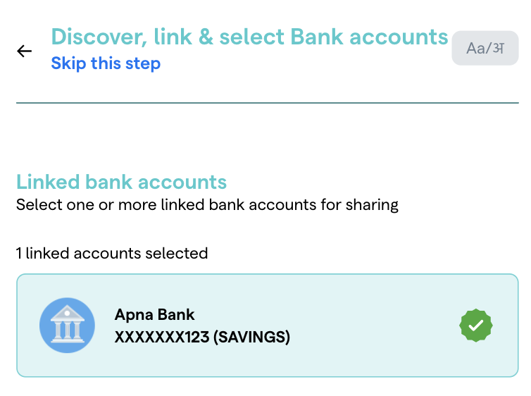
Linking of a financial account (for example—bank account or mutual funds)
-
Concept of data fetch frequency and data fetch interval
Regional languages#
It is very easy to just say that we offer regional language support, but the art of translating experiences is more than translating just words or phrases. Only when we sufficiently know the nuances of the language can we aim to achieve a reasonably consistent experience.
Taking help from solid research#

While the challenges were fairly new, we borrowed heavily from timeless principles put forth by “Future of data sharing (FODS)” project by D91 Labs, to guide us when we were flying blind. Presenting a couple of those instances here—
FODS Principle—Provide contextual information#
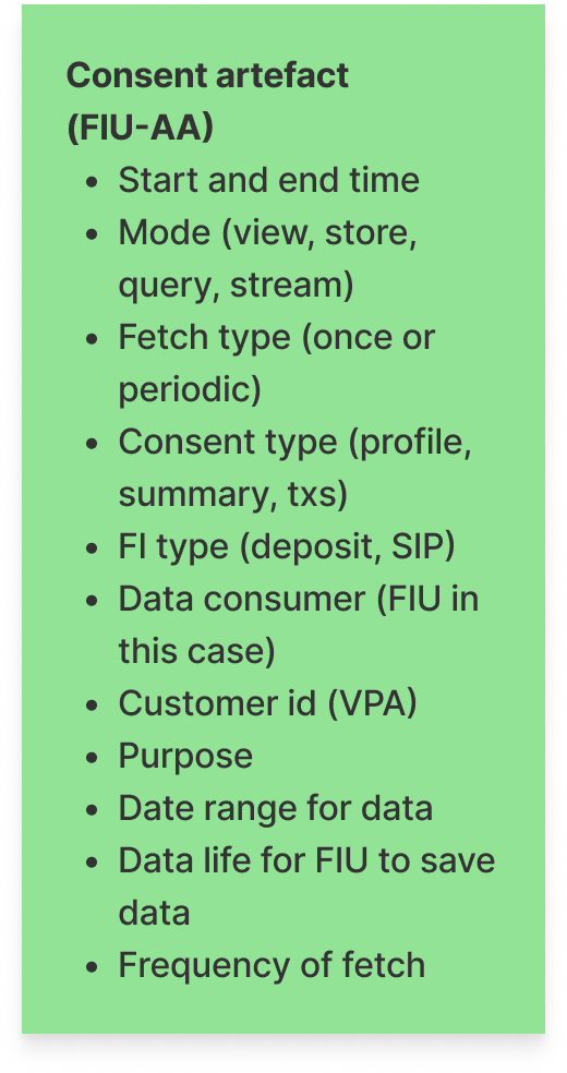
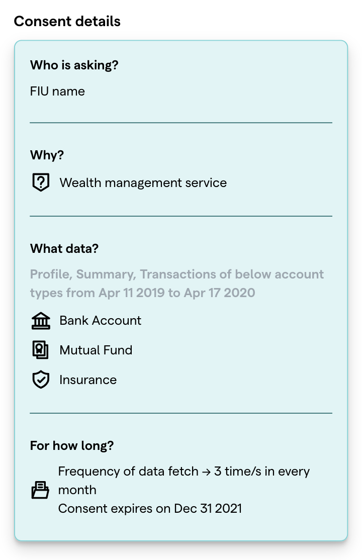
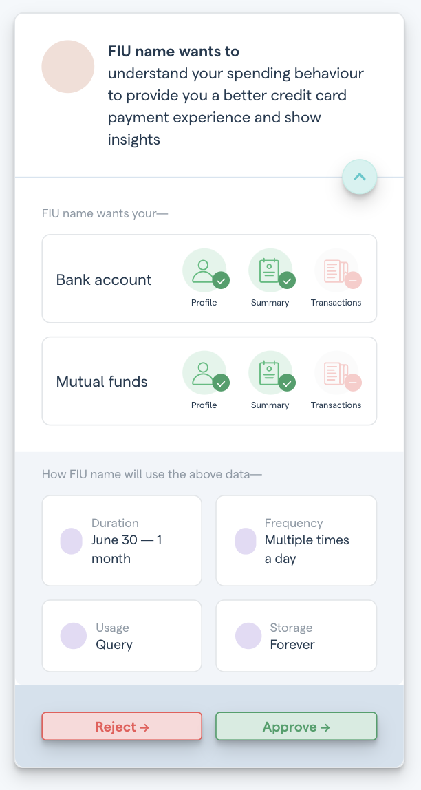
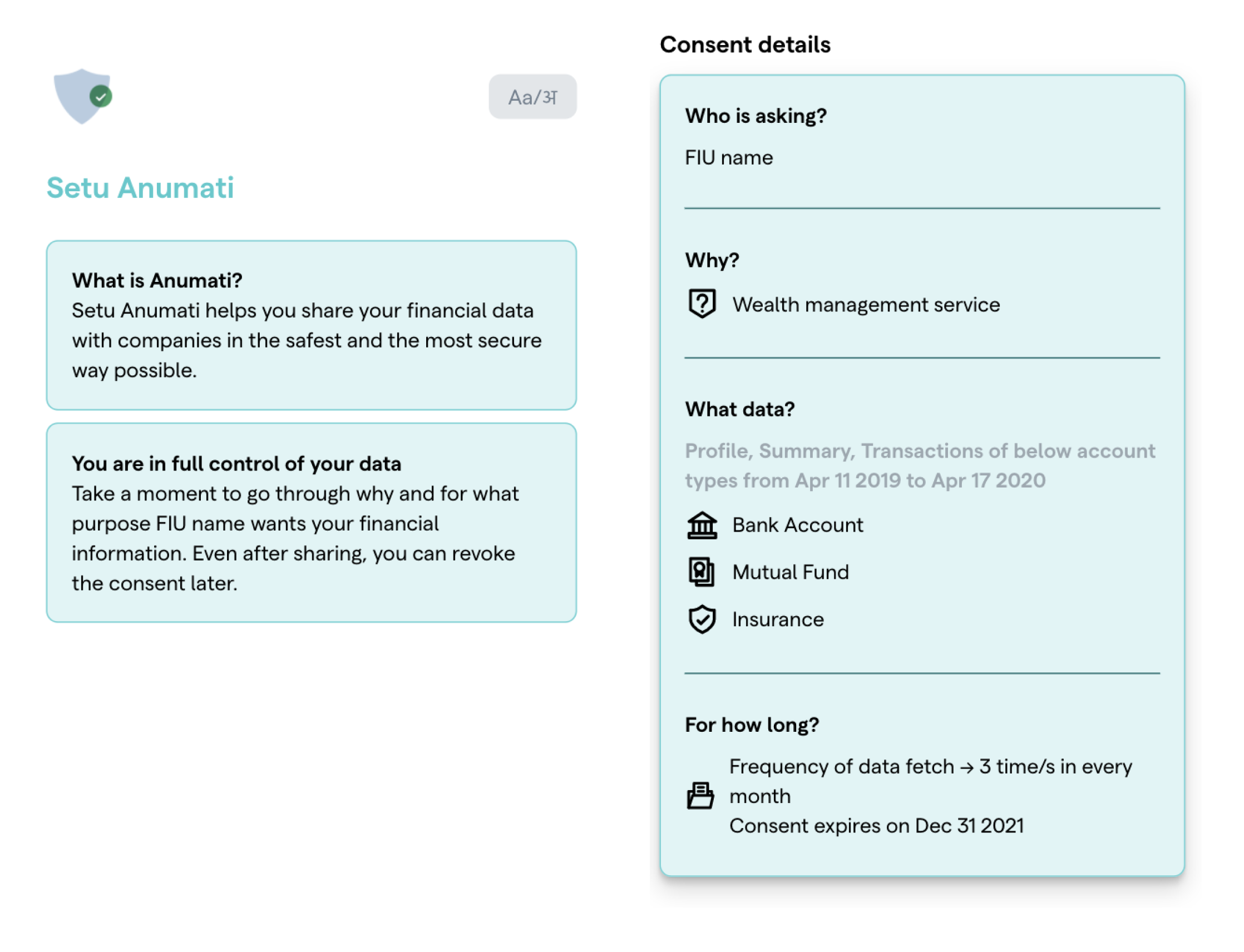
We broke down the whole consent artefact into simple question and answer format so that it enables users to have complete clarity on what is happening, while being crisp and reducing the cognitive load.
FODS Principle—Enable data sharing controls#
We used this principle when we enabled selective skipping of a financial data point that is asked in the consent. We showed this option upfront so that we create sufficient indication to the user that a particular step can be skipped and is not mandatory.
Some things that did not make the final cut#
Relying on visual communication#
A user interface feels no better than a printed record, without the use of visual language. Icons and illustrations aid in bringing liveliness to the interface, take the place of text for communication and make the interface look a lot less cluttered!
However, when communicating a new concept, relying too much on visual communication can actually backfire. Users might be left in a confused state—having to guess what an icon or the grouping of elements—is actually trying to convey. This is more evident in this case since it relates to financial data, which can have real life irreversible implications.
This was how we represented the consent artefact earlier. It had a clean and rich feel but it relied on the user’s ability to interpret grouping, communication through icons and so on.
Read on to know what we did instead!
Some solutions#
Right combination of textual and visual communication#
As we saw how relying too much on visual communication can be less helpful, we did not shy away from using text, so that the user has nothing to doubt, at every stage of decision making. We also supplemented them with UI patterns and icons wherever possible, but did not rely completely on them.
Language switch at any stage#
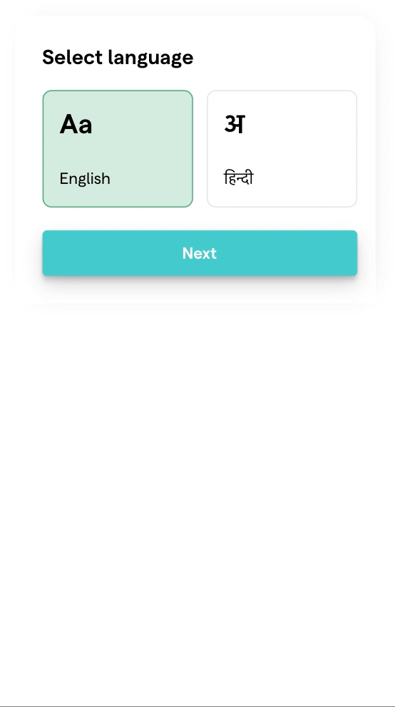
As we saw above, even the best attempt to translate experiences across languages, may fail to touch users. Hence, we allowed for a persistent language switch. We hope to help users switch languages at any stage—should they feel they are not able to understand the interface well in the language they initially selected.
A little about the whole web app#
We wrap up with a GIF of the web app. Of course, there is always scope for improvement and we will work hard to improve on aspects such as—
-
User flows around linking of an account v/s selecting an account and adding it to the consent
-
Handling cases where users have more than one account with the same FIP (for example, multiple accounts with the same bank)
-
Consent management screens where the user can view and manage consents as well as linked accounts
Read part 2 of this story at Design of award winning AA consent approval UI
If you have any thoughts or feedback, write to us at aa@setu.co
If you're looking to use Account Aggregator in your app, sign up to our sandbox right away! You can try, test and implement AA APIs within minutes.