Design of award winning AA consent approval UI

Vivek G
Product Designer

Roshni Nayak
Designer
30 Nov 2023 — DESIGN AND EVANGELISM
ACCOUNT AGGREGATOR
Design story of how we designed the Account Aggregator consent approval UI, various challenges along the way and some wicked solutions!
What’s with the award?#
Here’s a quick picture of the award we received at Samvaad 2023, which was India's First Account Aggregator Community Event. We won the award for the dual consent variant, which is one of the many combinations you can generate with our consent UI. View our full presentation here.

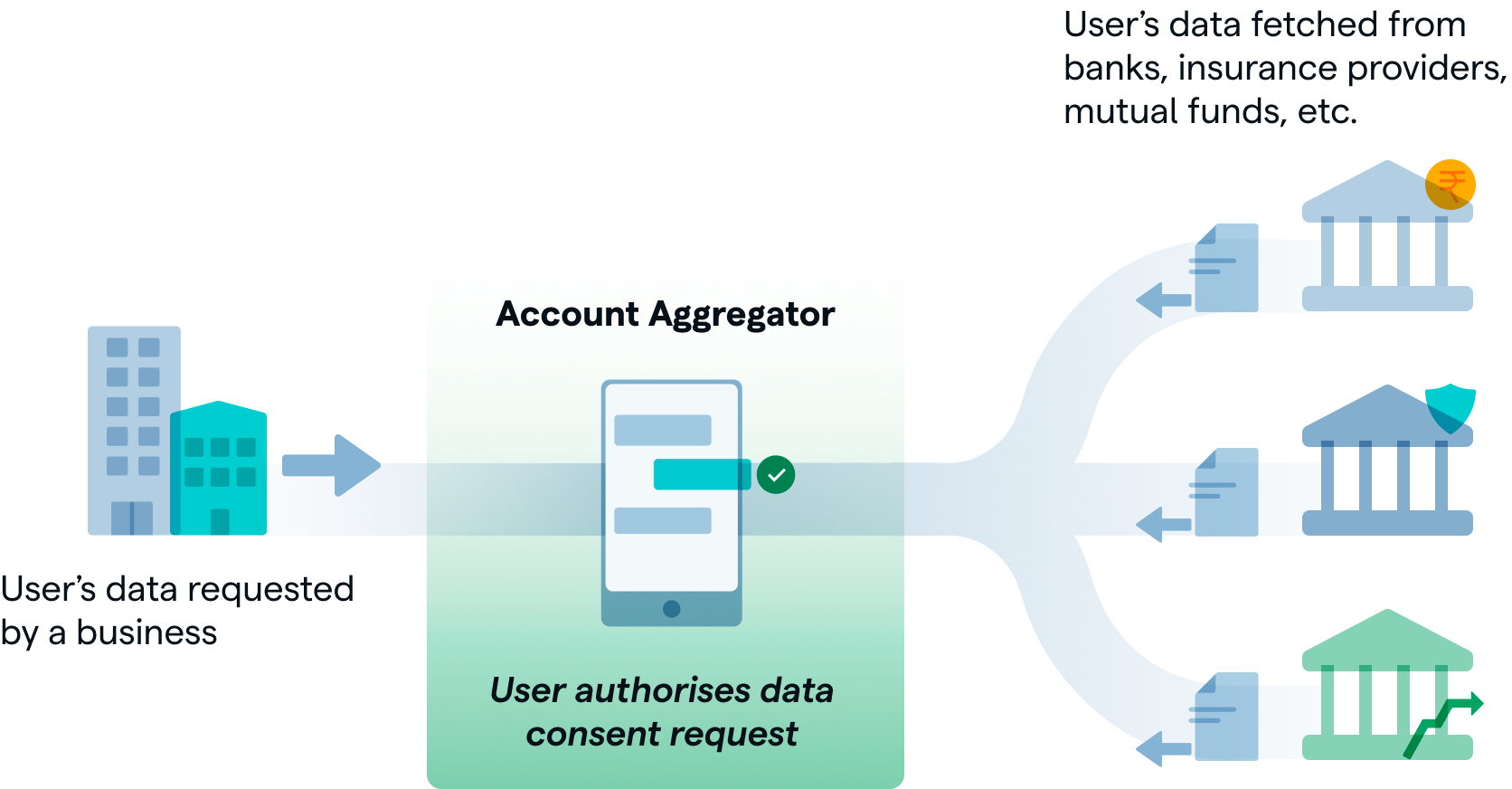
Account Aggregators? Consent approval UI?#
Account Aggregator framework, AA in crisp, is the latest addition to India Stack. While UPI simplified payments, AA aims to simplify data sharing and empower citizens through consent driven data sharing. In a nutshell, it involves mainly four entities—
-
Citizens—End users who would like to share their financial data with various organisations(FIUs) to obtain various financial services ranging from credit to wealth management.
-
Financial Information Users (FIUs)—Organisations who want to access financial data of their users with their consent and provide various services to them.
-
Account Aggregators(AAs)—RBI licensed entities that facilitate citizens to approve and manage their consents with any FIU. They safeguard the interest of the citizens by being a neutral third party between the FIU, citizens and the FIPs.
-
Financial Information Providers(FIPs)—Financial institutions that hold the financial data and accounts of citizens. These are banks, investment institutions, insurance companies, etc.
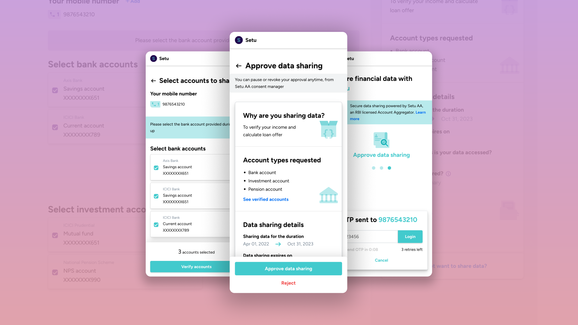
Embedded consent approval UIs#
To give a quick analogy of how consent approval happens from the perspective of an end user, imagine how payment gateways are surfaced. The user is redirected to payment gateway and completes the payment by choosing a payment method. This is an embedded journey that gets surfaced in the middle of the main digital process that the user was doing, as and when the need for payment comes up.
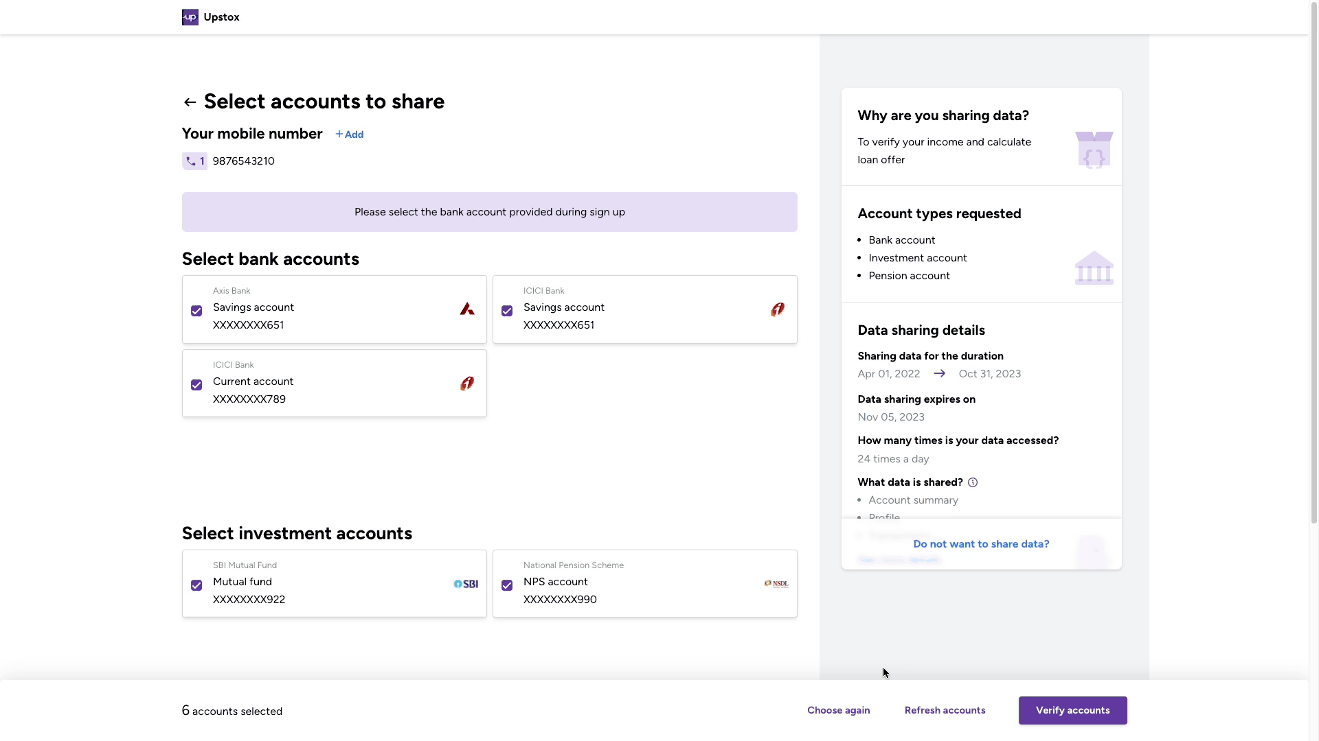
Similarly, in digital processes, there are many situations where the need to share financial data comes up. It could be to verify your bank account, check your bank statements, share your GST returns, etc. At these moments, consent approval UIs, which are implemented by AAs, are shown to users so that they can—
-
Choose what data to share
-
Provide their consent to share data
This design story is about one such consent approval UI designed at Setu. Let’s begin?
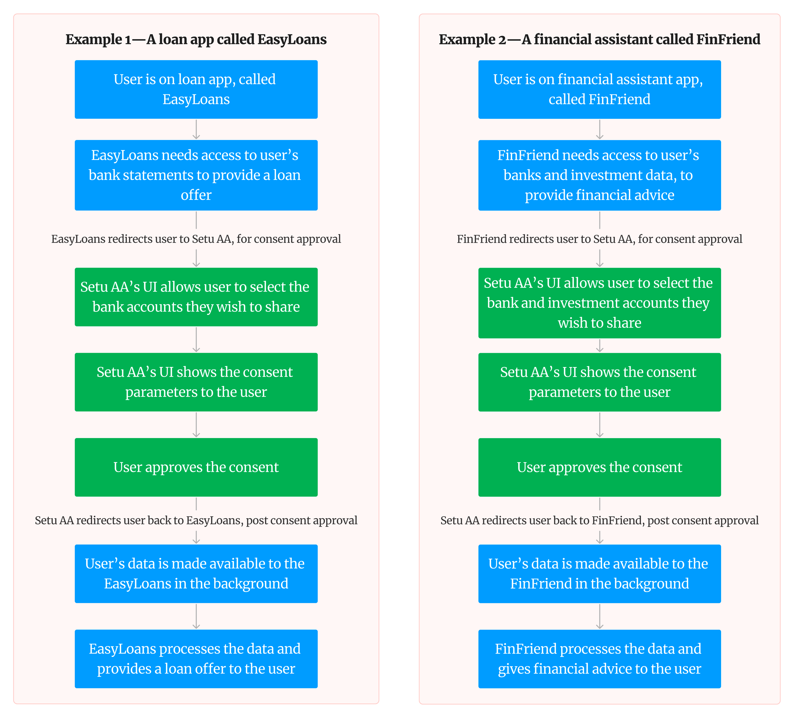
Broad user journey#
Since Account Aggregators are part of an ecosystem that enables a wide variety of use cases, the exact user flow will depend on the use case of the FIU. Without overwhelming with the details, here are two easy to understand examples.
Understanding the problem space with research#
This is the second version of consent approval UI. So we had lots of learnings from release of first version, ranging from onsite interviews and prototype testing with rural users, analytics data from first version of the app, card sorting techniques, market information.
However, this did not mean that we blindly used them for this version, since there were new challenges, changes to business constraints, newer expectations from the market and users. Let’s dive into some of these below.
Some challenges and some solutions#
#1 Elegant white-labelling and powerful customisation#
Elegant white-labelling#
A quick demonstration of how the app looks for various brands!
All brand names and logos are trademarks of the respective owners
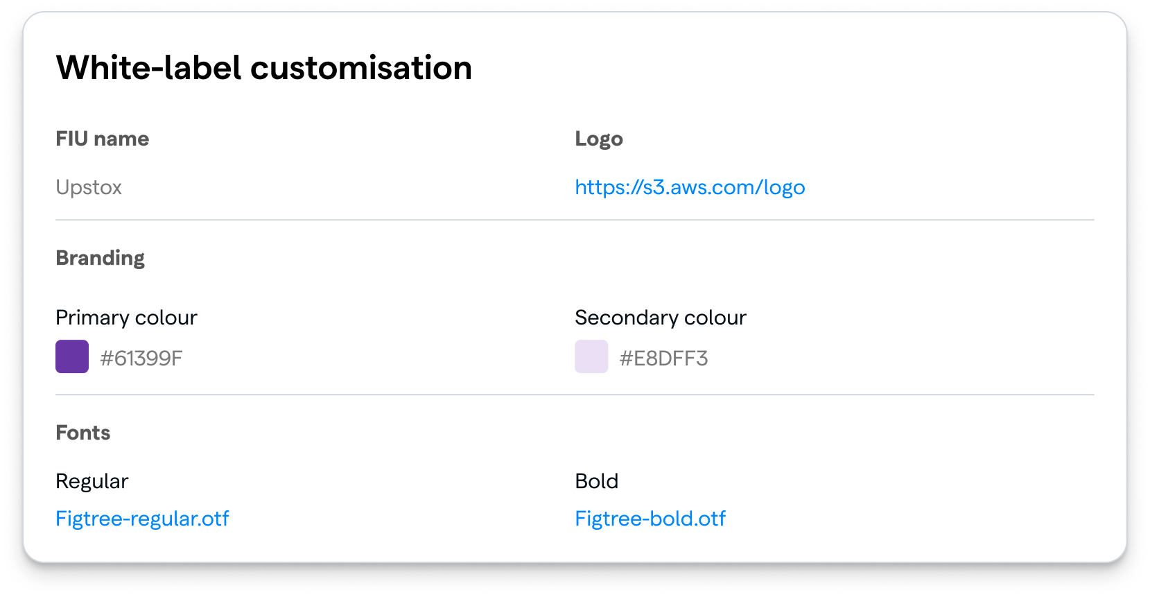
Allowing for white labelling in UI design(customisation of colours, fonts, logos) without breaking the UI, can get very tricky. We tackled this by—
-
Intentionally using a single tone design language—less chances of unpleasant colour combinations
-
Auto calculating secondary colour based on primary colour, for contrast consistency
-
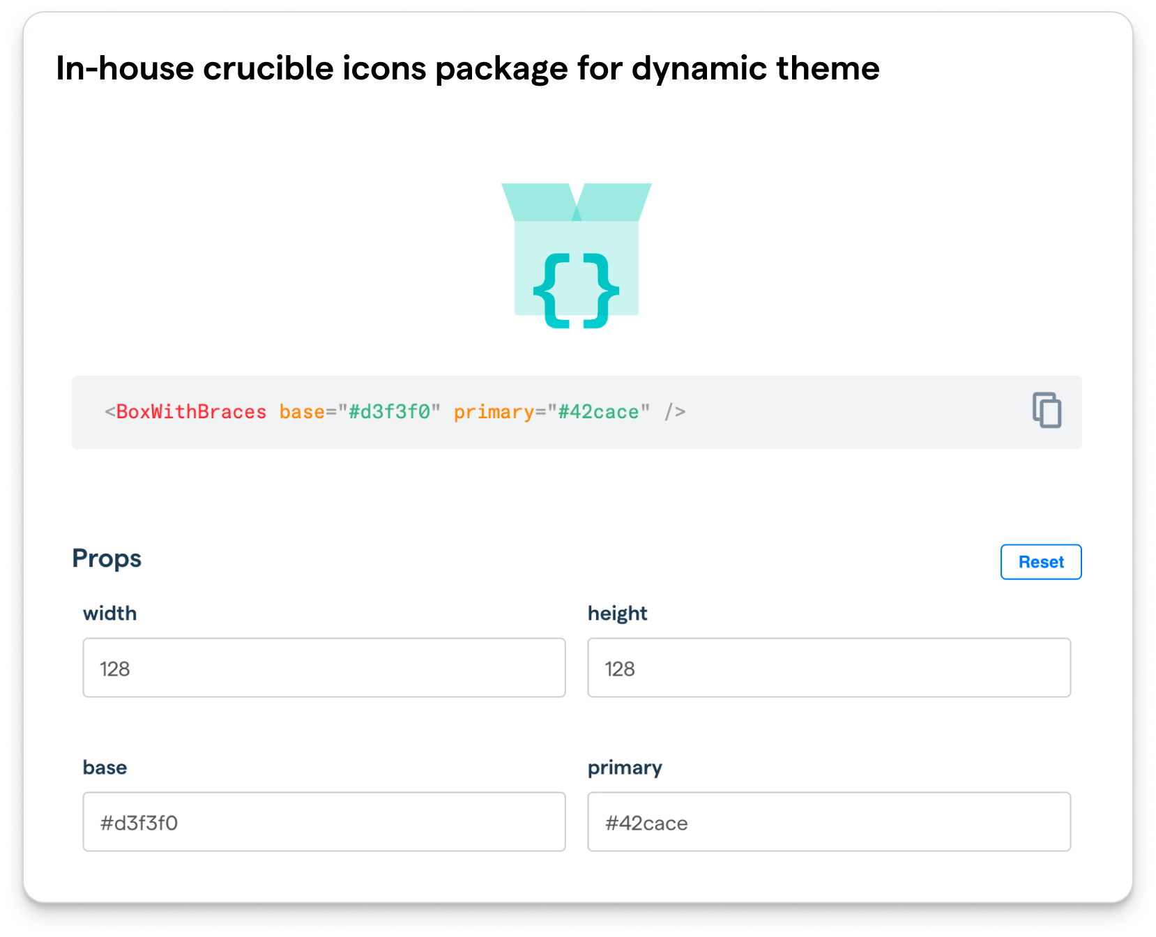
Using our in-house crucible icons package, that lets us customise icon colours on the fly
Powerful journey customisation#
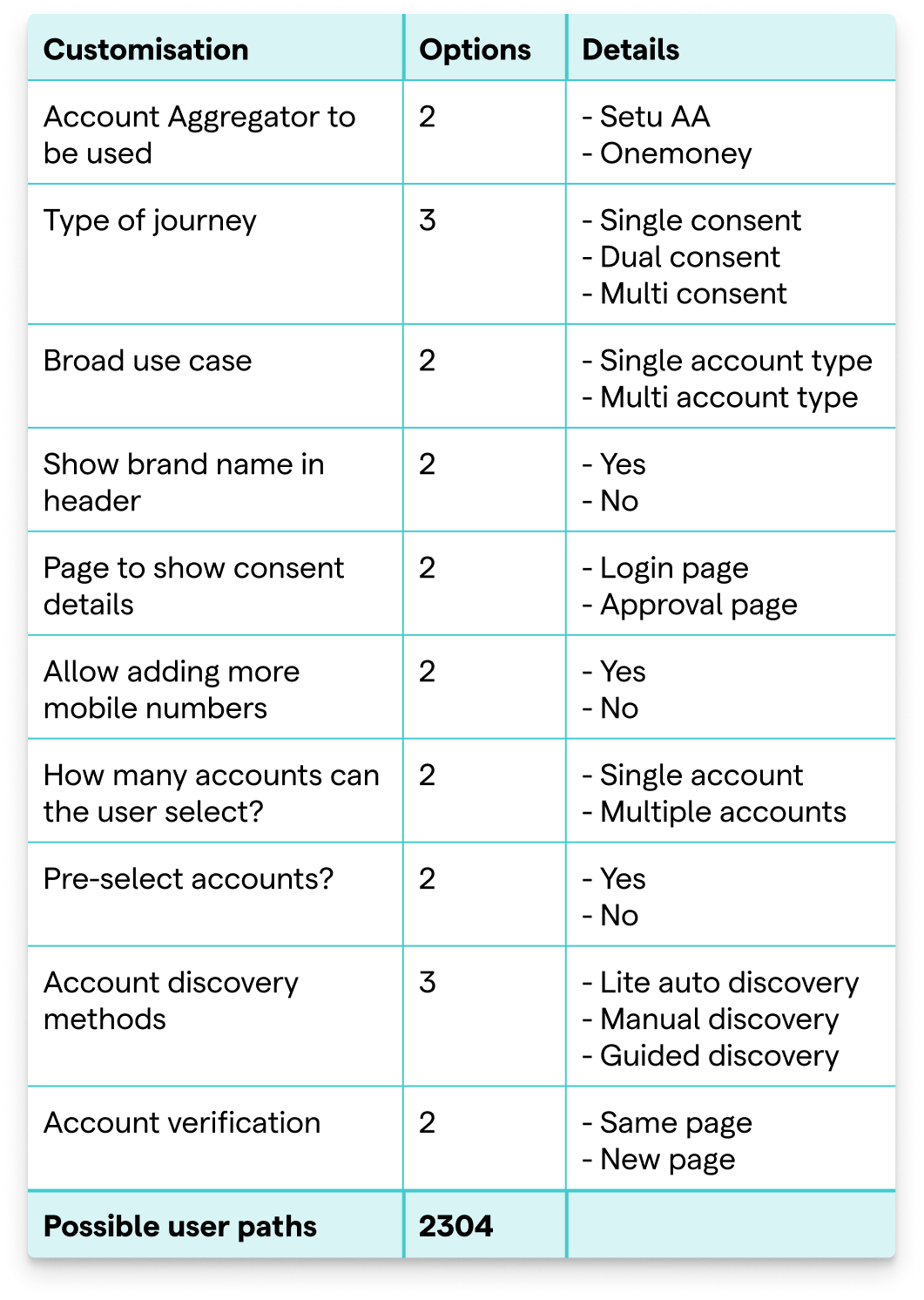
Consent approval journey is embedded in the FIU user journey. Hence, it is important that the consent approval part blends well with the rest of the FIU user journey.
As a result of many conversations with FIUs, testing with users and more, we provided a host of configurable parameters to the FIU. Within the allowed limits, they could customise the UI as well as the user path to provide a seamless experience to their users.
#2 Abstracting technical complexity with relatable mental models#
When debit cards, internet banking, UPI were not yet household names, it was confusing for a lot of people to do online payment transactions. Account Aggregator ecosystem, for data sharing, is in a similar state, where “consented data sharing” is an alien concept to most people. So we made sure to abstract the technical complexity and the jargon with easily understandable mental models, which are comprehendible by a wide range of people.

The journey was designed to not overload the average user with lots of information, yet provide control and complete understanding to power users.
#3 Worshipping edge cases, just like the happy flow#

-
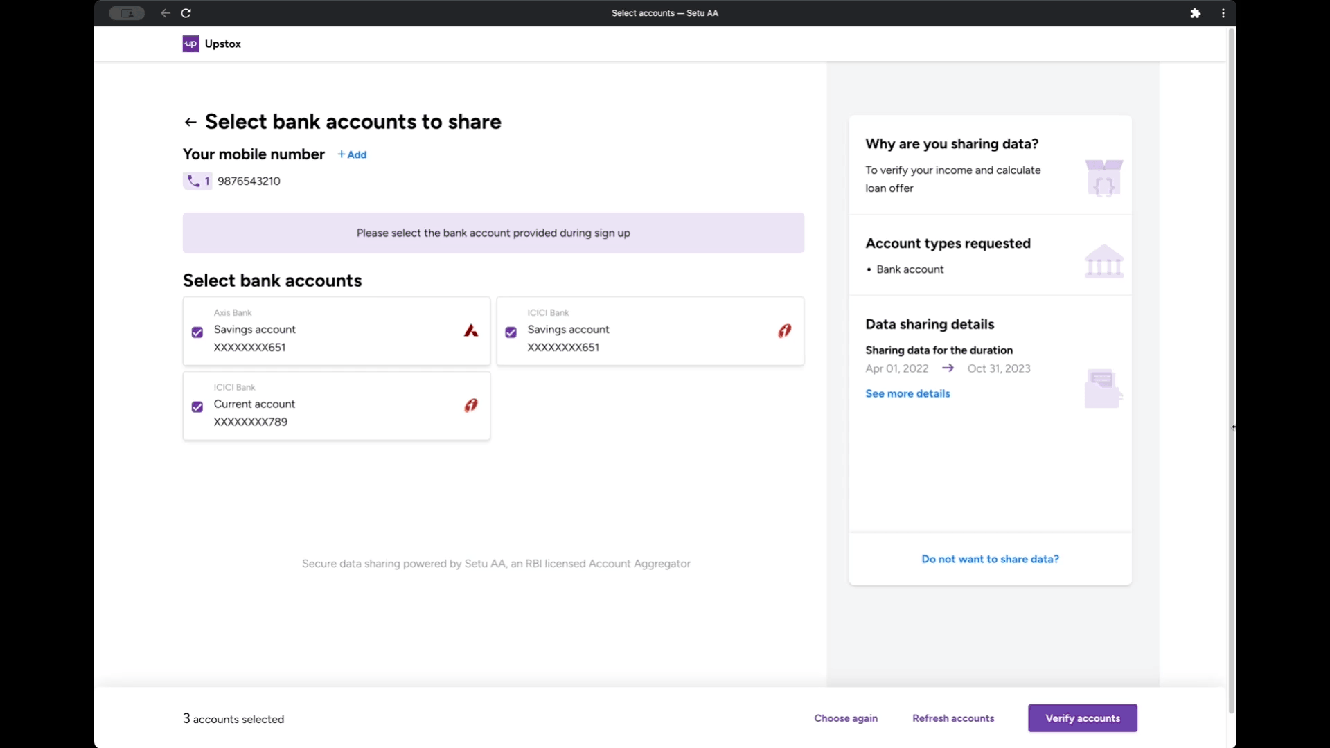
Preventing errors in the first place—Users tend to forget instructions that were given just 2 screens before. It is only natural! So, we added a parameter called “Support text”, which can be used by the FIU, to guide the users to select the right accounts. Selecting accounts is one of the most confusing points of the journey, since it forces users to think and recall from memory—“What accounts to select?” So, the support text helps exactly with that “Not sure what to do? Don’t worry, you were supposed to select these :)”
-
Contextual help, not user guide—Since the Account Aggregator ecosystem is in early stages, there were more people on the unhappy flows than the happy ones. Banks not yet supported, temporary issues, incorrect mobile numbers used, users choosing the wrong banks and many more edge cases! It is easy to just write these all in a manual and let the user take up the burden of figuring out their problem. Instead, we made our help smarter. The recommendations are contextual—they are selectively shown and hidden based on the user needs at that moment. They are also ordered in the order of likelihood of occurrence.
#4 Using motion to improve UX and of course, aesthetics#

#5 Born responsive#
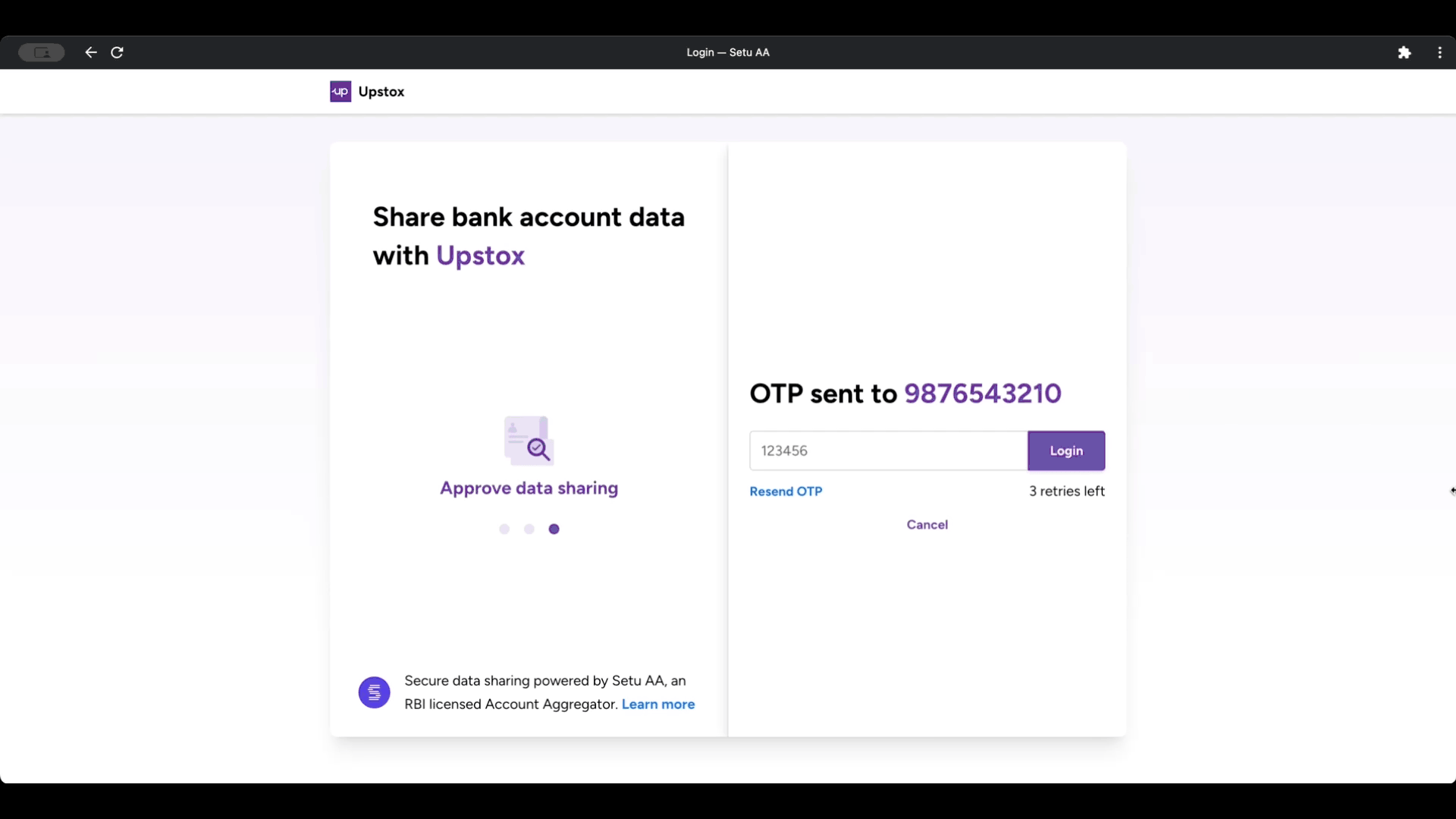
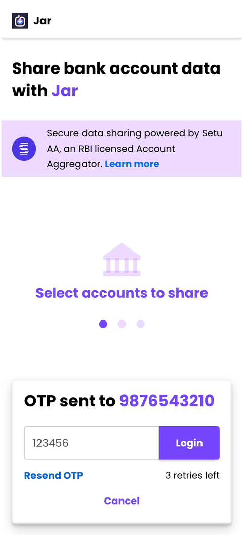
#6 Handling painful multiple OTPs—pleasantly#
The ideal solution would have been a single OTP. While that is not possible due to AA eco-system limitations, we added some interaction design magic—auto close the current container after OTP submission, expand the next container and auto trigger the OTP for the user—makes the experience a little bit pleasing!
Wrapping up#

Okay, that was a lot of GIFs, but as they say “A picture is worth a thousand words, and motion is worth a thousand pictures!” We hope you found some inspiration, reading between them!
Well, we’ll keep improving our UI to make it more and more useful to our customers and their end users. Bye bye until next time!