Design principles for data sharing through Account Aggregator apps
10 Aug 2021 — D91 LABS — FREE YOUR DATA
ACCOUNT AGGREGATOR

This article is a part of D91 Labs’ Future of Data Sharing project. The original authors were Dharmesh BA and Lakshmi Ajayan. It has been edited for the purposes of this article by Monami Dasgupta. Illustrations and UI by Prajna Nayak.
Usually, a person’s or entity’s financial data is spread across multiple financial institutions. For instance, a person’s savings account, loan account, fixed deposit account, mutual funds investments, insurance account, as well as pension account details are held by different institutions which are regulated by either Reserve Bank of India (RBI), Securities and Exchange Board of India (SEBI), Insurance Regulatory and Development Authority (IRDAI), Pension Fund Regulatory and Development Authority (PFRDA). The transfer of information from one financial institution to another typically involves cumbersome and time-consuming procedures like retrieving data from each institution, creating hard copies of the documents, and physically sharing the documents with another institution. This loop goes on for each new institution that the user wants to engage with.
To solve this problem, RBI has approved licenses for a new type of financial institution - Account Aggregator (AA).
Account aggregators are RBI licensed entities that provide a digital platform for sharing financial information of a user with their consent. Using AAs, a user can consent to share their financial data from multiple Financial Information Providers (FIPs) to a Financial Information User (FIU). An AA acts as a conduit between FIUs and FIPs and does not process data. An AA is ‘data-blind’, as the data that flows through an AA is encrypted and can be processed only by the FIU for whom the data is intended. Also, an AA does not and cannot store any user’s data – thus, the potential for leakage and misuse of the user’s data is reduced. Additionally, no user’s financial information is retrieved, shared, or transferred by the Account Aggregator without the user’s explicit consent.
One of the key components that can determine the success of AA is the user experience which should be safe, smooth, and intuitive. To better understand this, D91 Labs created a UX playbook for consent driven data-sharing within account aggregators as a part of their Future of Data-Sharing project. This playbook offers six design principles for anyone developing a data-sharing workflow using AA. Before we jump into the design principles, let us understand why we need these principles.
The AA framework is in uncharted territory, facing a new set of challenges. As a consent-based system of data sharing, user trust will make or break the AA framework, and users are more likely to trust when they understand what is being asked of them, and why. Honoring the spirit of personal data protection requires that user-facing applications actively help users understand the implication of their actions and choices. These design principles were created to fulfill two specific research goals—
-
Design for user trust
-
Design for informed consent
To build this design toolkit, we conducted primary research, roundtable discussions with industry and policy stakeholders, a design jam with the community, and usability testing.
To take our effort one step higher we're launching a sandbox for developers/UX designers to see how AA can fit into their applications. These principles and the sandbox can come together in the broader story of "get your app UX ready for AA".
Design principles for account aggregator apps#
In this report, we have illustrated a fictional personal loan application called Moneybox which uses a fictional account aggregator called Ekata. The account aggregator will be used to share bank statements to disburse loans.
Design Principle—I#
Establish authenticity to gain trust#
How might we gain the trust of the users to adopt account aggregators to share data?
The differentiation between genuine and fake applications is getting harder as the days pass by. New internet users fall prey to scams that rob them of their money and identity. The rise in online digital frauds and data leaks makes users skeptical about sharing information on new platforms especially when they involve the movement of money.
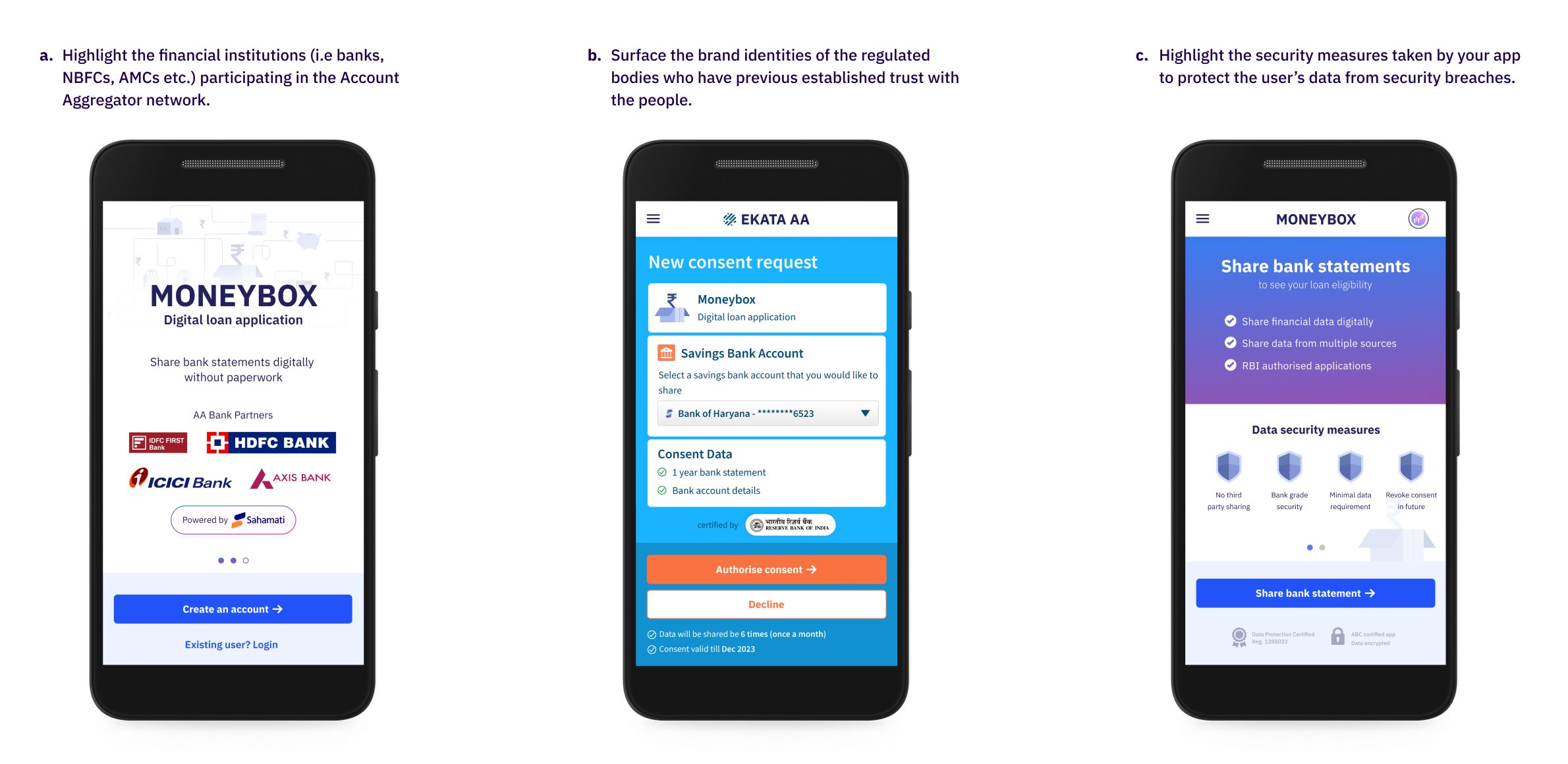
Establish association with governing bodies granting the license and banking institutions to gain trust. This eliminates skepticism and allows users to adopt the app with better confidence.
UX Checklist:#
-
Highlight the financial institutions (i.e banks, NBFCs, AMCs etc.) participating in the account aggregator network.
-
Surface the brand identities of the regulated bodies that have previously established trust with the people.
-
Highlight the security measures taken by your app to protect the user’s data from security breaches.
Design Principle—II#
Provide contextual information#
How might we create a positive behaviour change by providing necessary information at the right time?
People encounter the fear of the unknown when they are introduced to account aggregators for the first time. They have questions and doubts at every step to make an informed choice. Since AAs are a novel idea and the lack of understanding about them triggers users to fall back on the older and familiar methods of data sharing. For example, one might choose to upload a PDF of a bank statement vs sharing data via AAs.
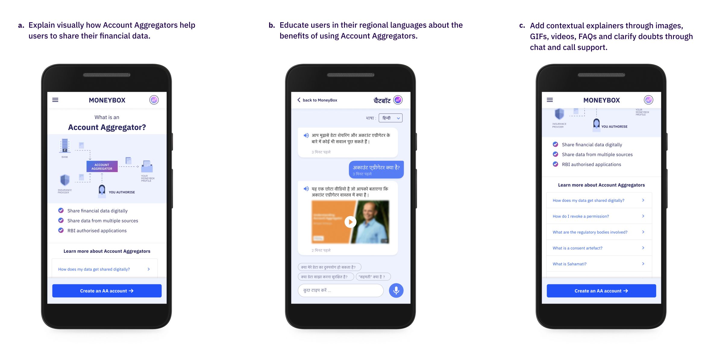
Educate your users with a short introduction about what Account Aggregators (AA) are and how they function. Break down the educational material into shorter snippets and surface them contextually to reduce cognitive load. For low literacy users, increase accessibility to the provided information by converting them into images, audio, video.
UX Checklist:#
-
Explain visually how Account Aggregators help the users to share their financial data.
-
Educate the users in their regional languages about the benefits of using account aggregators.
-
Add contextual explainers through images, gifs, videos and clarify doubts through chat and call support.
Design Principle—III#
Nudge to make relevant choices#
How might we help the user in making relevant choices?
Sharing financial information through account aggregators demands a user make critical choices at various points. They face cognitive overload while deciding to choose the appropriate account aggregators, financial information, and relevant accounts to share. This results in decision paralysis as they fear that the cost of making a mistake could result in irreversible damage.
Empower the users with relevant timely nudges that would ease their decision-making process and eliminate the fear of making a mistake. Break down larger activities into smaller tasks for the user to act upon without cognitive overload.
UX Checklist:#
-
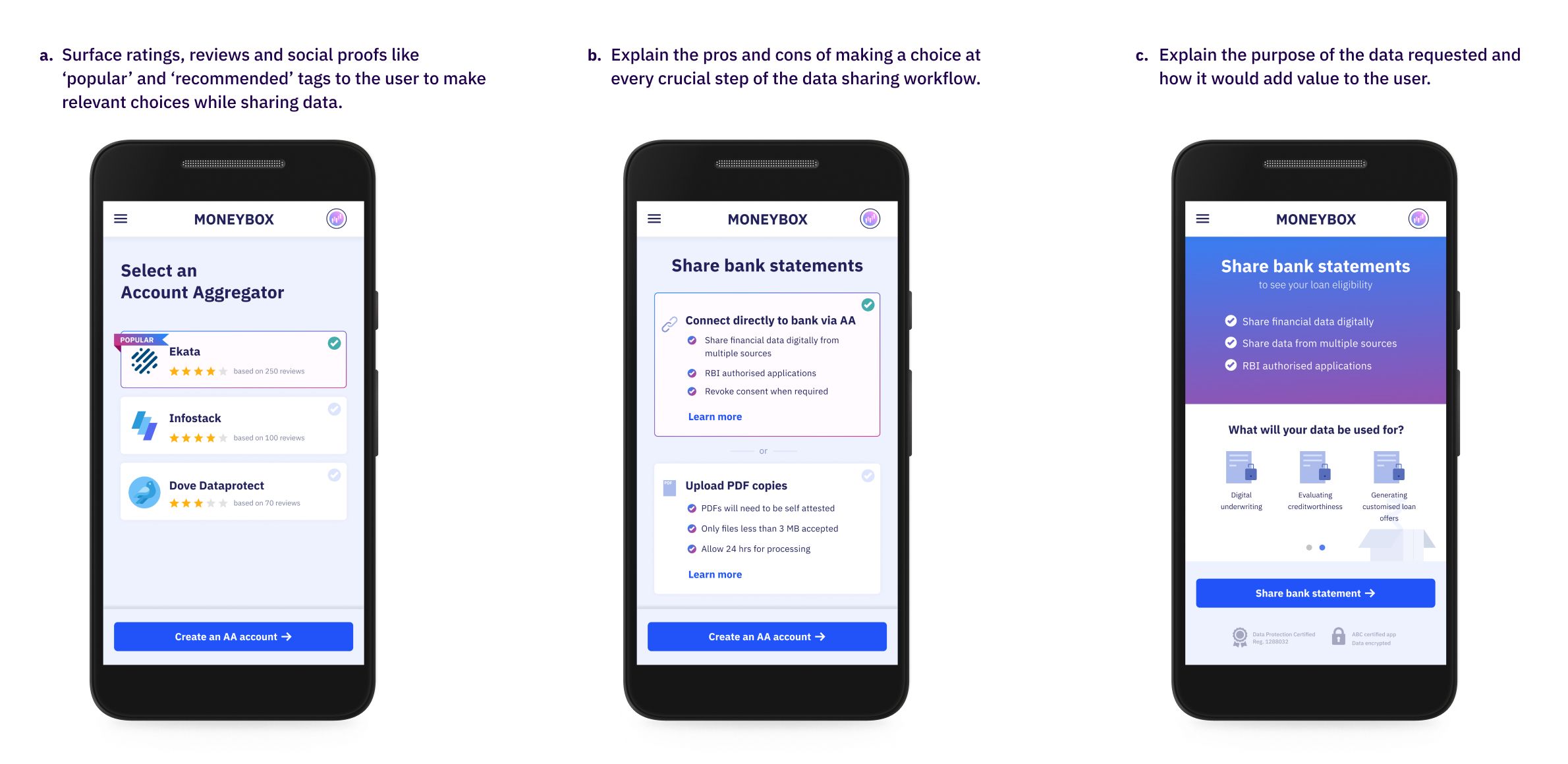
Surface ratings, reviews, and social proofs like ‘popular’ and ‘recommended’ tags to the user to make relevant choices while sharing the data.
-
Explain the pros and cons of making a choice at every crucial step of the data-sharing workflow.
-
Explain the purpose of the data requested and how it would add value to the user.
Design Principle—IV#
Enable data sharing controls#
How might we enable the users with controls to share their data?
The ease of data sharing comes with the fear of being ripped off of their sensitive personal information without their permission. There are two kinds of fear that the users associate with. The first is the fear of over leveraging the data (i.e) sharing more data than required and the other one being data abuse (i.e) the fear of misusing the data for non-stated purposes. They might choose to discontinue their journey inside the app/service if they are refused appropriate control over what can be shared.
Segregate your data requirement into mandatory and optional financial information. Educate the users about why optional financial information is required and how it would benefit the users. Allow the users to pick and choose the financial information they are willing to share.
UX Checklist:#
-
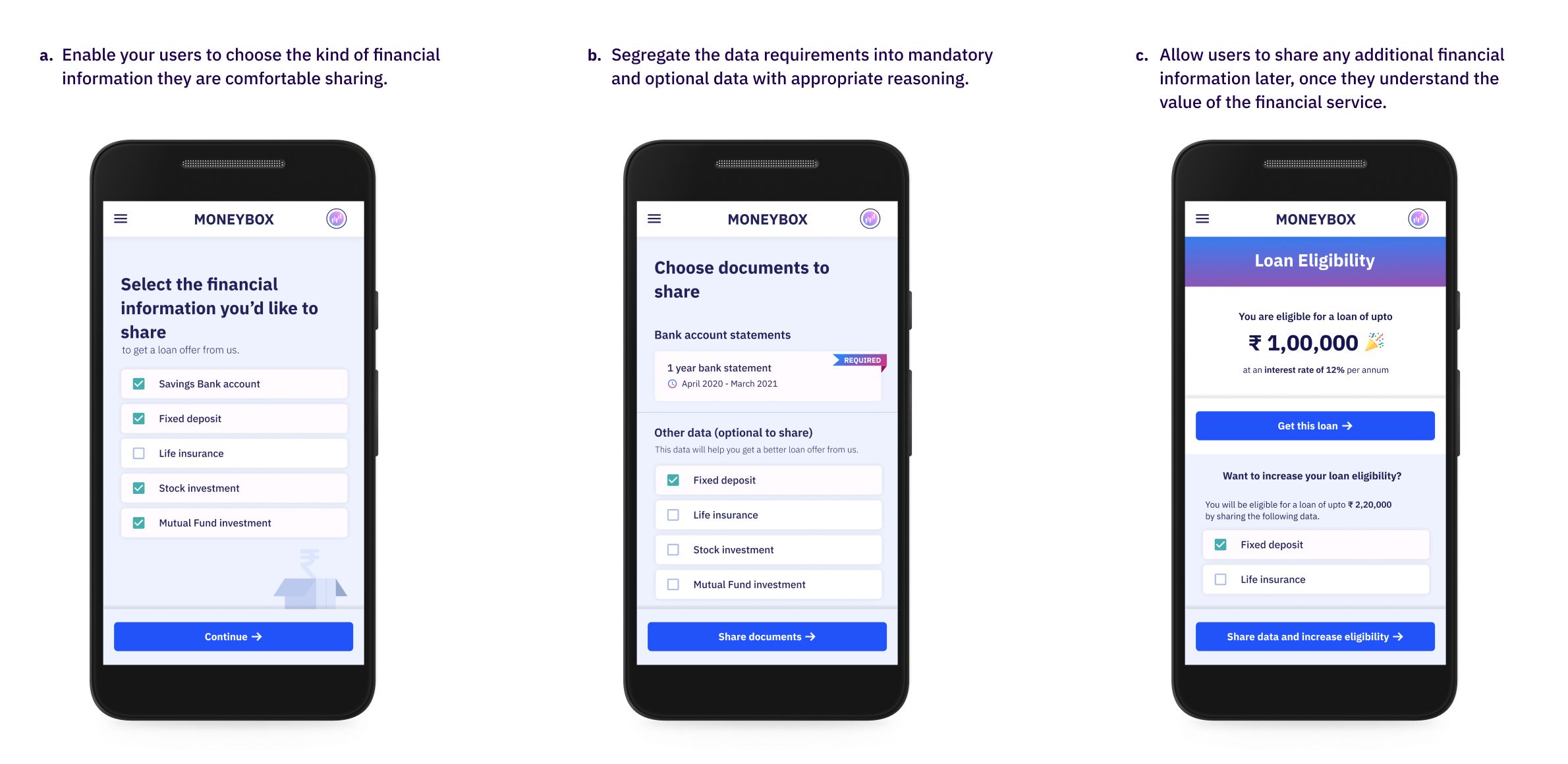
Segregate the data requirements into mandatory and optional data with appropriate reasoning
-
Enable the users to choose the kind of financial information that they are comfortable sharing.
-
Later allow users to share any additional financial information once they understand the value of the financial service.
Design Principle—V#
Establish grievance redressal workflows.#
How might we support the users with their queries post data sharing?
Users fear the lack of accountability in digital applications when something faces issues. In an offline world, the users could walk into a bank branch or speak to an agent who helped with the service and could get their queries answered. Though most modern applications have a help desk and support they're not easily accessible during the need of the hour. Users' previous experience with poor customer service in banking services would affect how they view their current application.
Surface customer care numbers and help desk chats at every possible touchpoint. Establish a human contact through service executives who could help the users with their queries. Create the support and help modules in native languages or through videos that could be accessible by the larger set of users.
UX Checklist:#
-
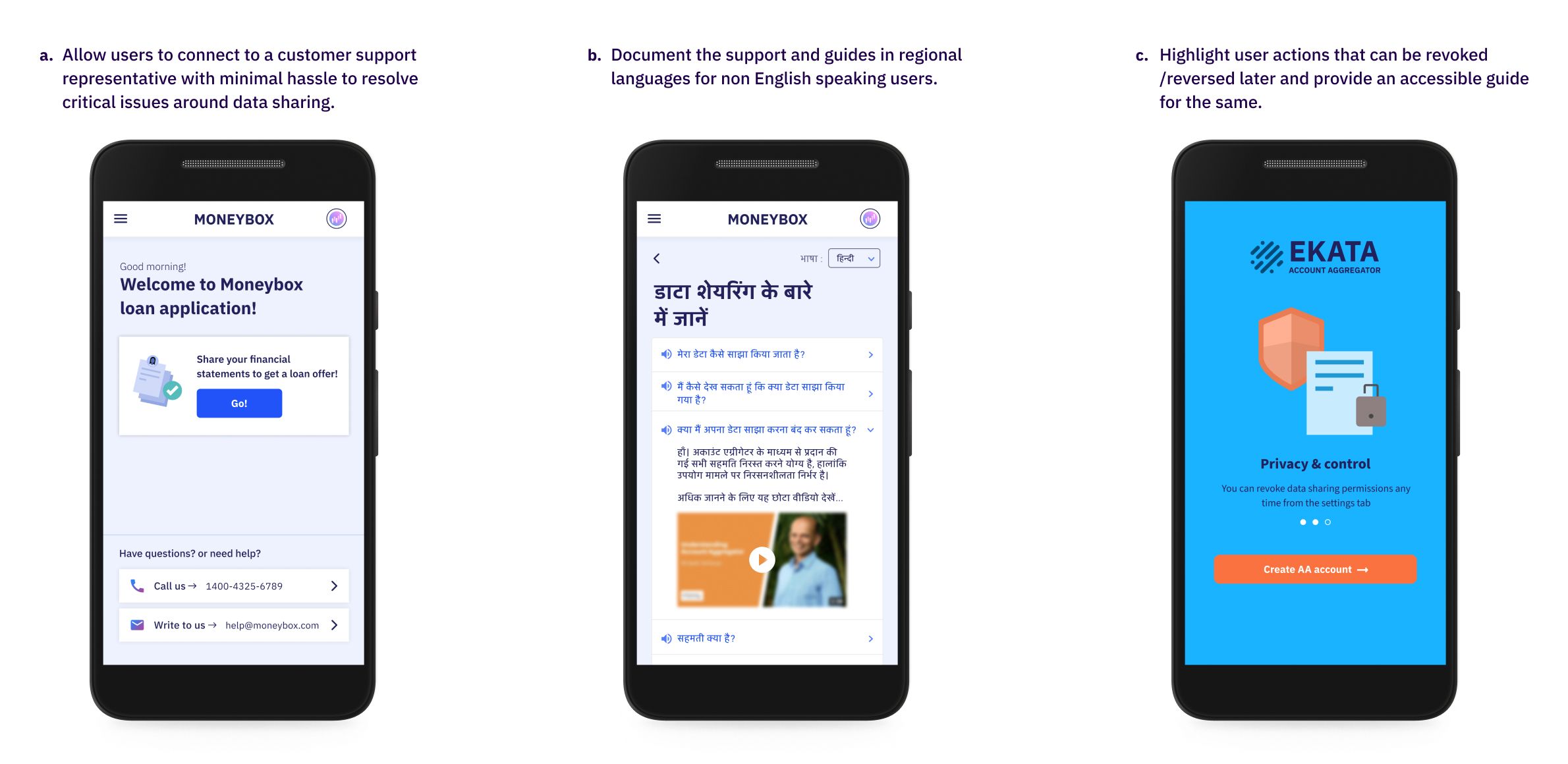
Allow users to connect to a customer support representative with ease to resolve critical issues around data sharing.
-
Document the support and guides in regional languages for users unfamiliar with English to access them.
-
Highlight user actions that can be revoked/reversed later and provide an accessible guide for the same.
Design Principle—VI#
Provide visual cues#
How might we boost the confidence of the user through appropriate feedback loops?
Data sharing with AAs involves multiple touchpoints such as the FIU, AA, FIP and the data that is being shared is largely invisible to the user's eyes. The fear of navigating these unknown spaces leaves the users in splits when they do not receive appropriate feedback for their actions, leaving them feeling anxious with second thoughts about their decision.
*Provide visual cues about the kind of financial information that is being pulled from the FIPs. Communicate reasons for errors and waiting time during the data sharing. Pinpoint the system responsible for the delay and further actionable that a user could perform to resolve it. Enable double confirmations at touchpoints where the user makes critical decisions. Notify the user every time whether the data being pulled is successful or not. *
UX Checklist:#
-
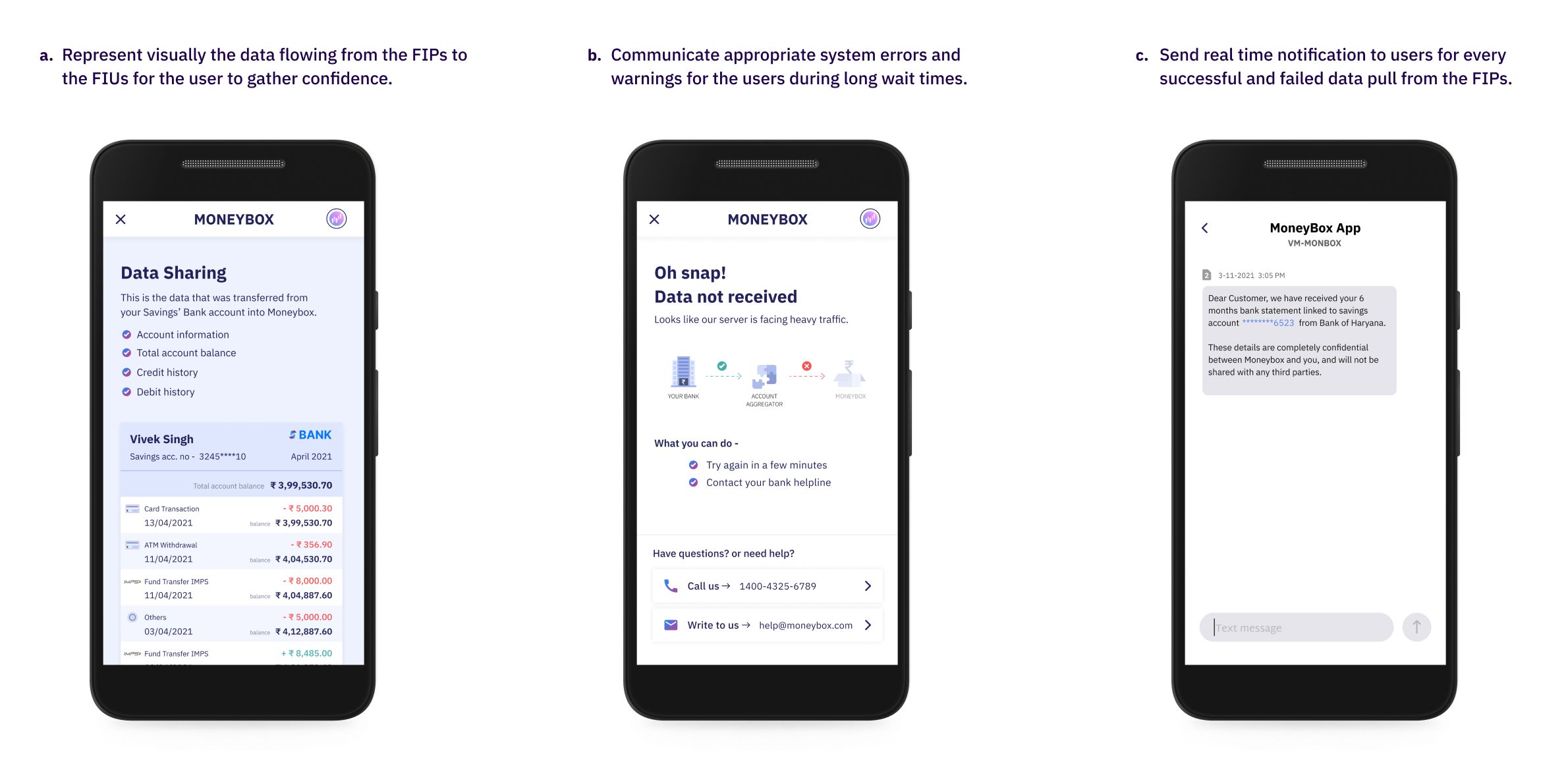
Represent visually the data flowing from the FIPs to the FIUs for the user to gather confidence.
-
Communicate appropriate system errors and warnings for the users during long wait times.
-
Send real-time notification to users for every successful and failed data pull from the FIPs.
These design principles are customer-centric and intended to make the user journey hassle-free and safe. They also hold the potential to offer innovative financial products and services to existing and new-to-bank customers thus pushing the needle on financial inclusion.
If you're looking to use Account Aggregator in your app, sign up to our sandbox right away! You can try, test and implement AA APIs within minutes.


